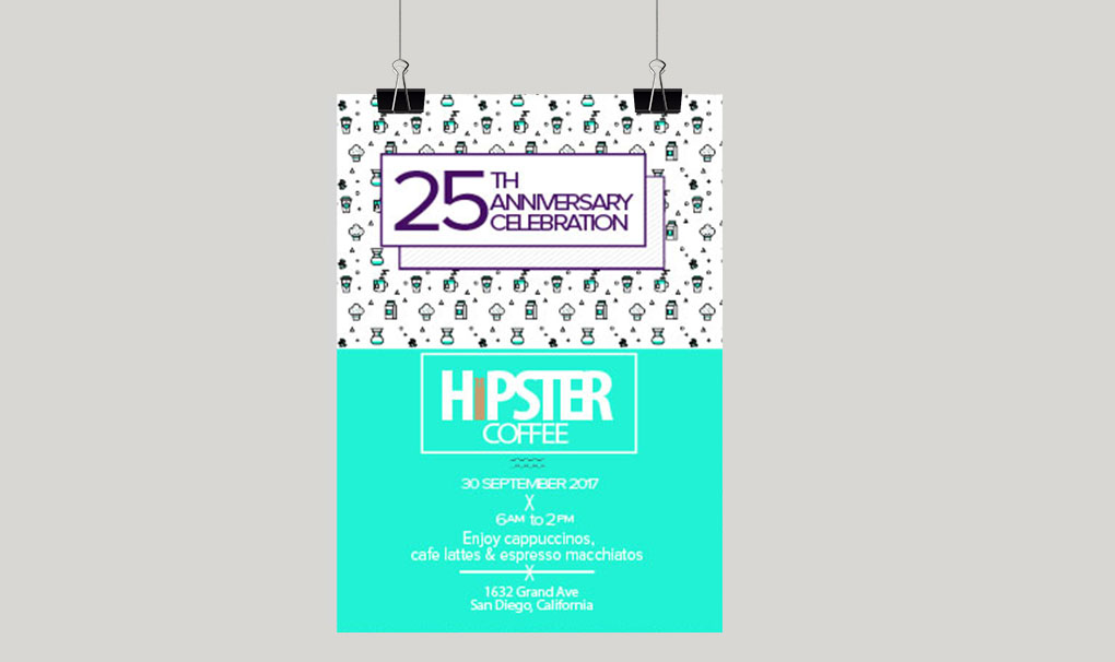
The direction of this design is to celebrate the anniversery for a local cafe. The design should highlight elements of art in a contemporary, minimalist fashion through muted color tones while appealing to the latest local trends, ultimately the design’s purpose is to garner a wholesome and artful design.
The poster has a simple design that communicates all of the pertinent information, keeping the design crisp and fresh. This minimal design appeals to the appetitites of trendy locals, locals that want to embrace the community and have passion for their select medium, coffee. They will be in the age group of 20 with an open mind and willingness to be a part of the community
The design is minimal and emphasizes the i in the name. The i from the logo is prominently displayed on the poster. This is in order to emphasize the indidual attnetion that will be felt with every coffee order. The simple composition and minimal use of colors are designed to appeal to the targeted audience. This design will give Hipster a fresh and modern look.